13 Data Visualisation II
What is R? - R is a language and environment for statistical computing and graphics.
- Data visualisation serves two purposes:
- Discovery
- Presentation
- R Markdown
- ggplot2
- (shiny)
- R packages
- Both R Markdown (2014) and ggplot2 (2005) are relatively new functionalities of the R ecosystem. - This lecture uses functionalities that are provided by the R ecosystem rather than the core base package
Recommended readings
- R Packages
- R Markdown: The Definitive Guide
- ggplot2 cheatsheet
- Publication-quality figures
- Nicolas P. Rougier, Michael Droettboom, Philip E. Bourne, Ten Simple Rules for Better Figures, PLOS Computational Biology, code
- Daniel Evanko, Data Visualization: A view of every Points of View column, Nature Methods, methagora
13.1 R Markdown
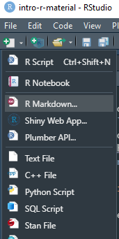
- This week’s lecture notes are all in R Markdown format (rather than powerpoint)
.nb.htmlare rendered notebooks (with option to download the R Markdown source)- Interaction with
.Rmdfiles in RStudio is similar to Jupyter Notebooks (IPython) rmarkdowncomes installed with RStudio
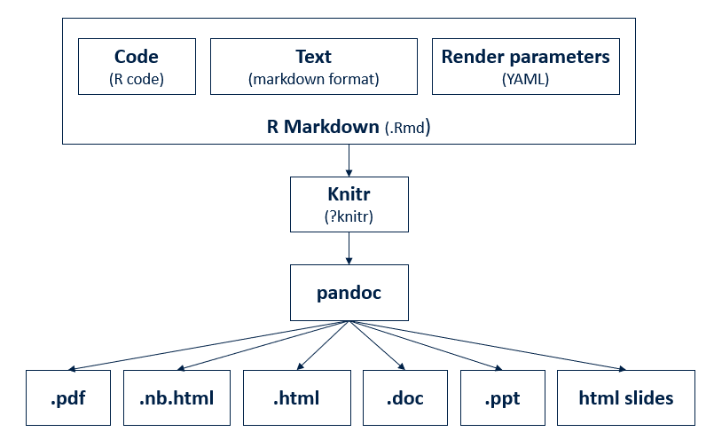
- Write once, output in many formats
- As html
- As pdf
install.packages('tinytex')tinytex::install_tinytex()
- As slides (ppt, HTML-based presentations)
- Combines
- Descriptive text
- Code
- Code result
13.2 ggplot2
To use ggplot2 in your script, put library("ggplot2") at the beginning of your .R script:
SO: What is the difference between require() and library()
13.2.1 Basics
In the graphics package, plots are created by a combination of high-level and low-level plotting functions. Plots are first created by high-level functions. Low-level functions add/modifies elements on top of the existing plot. ggplot2 has a similar approach.
Each graph produced by ggplot is a top-down view on a stack of plots. At the bottom of this stack is the ggplot function which holds the data component. This data set is then mapped by geom_* functions (i.e. the geom component) onto a coordinate system to produce a plot.
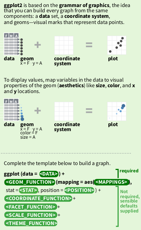
Each geom function has its own geometry definition of how to present the data:
geom_line()draws lines connecting data pointsgeom_point()draws data points as individualsgeom_histogramputs values of the plotted variable into bins before drawing vertical bars showing the size of each bin.geom_*- To see what
geom_functions are available inggplot2:
 [1] "element_geom"           "geom_abline"            "geom_area"
 [4] "geom_bar"               "geom_bin_2d"            "geom_bin2d"
 [7] "geom_blank"             "geom_boxplot"           "geom_col"
[10] "geom_contour"           "geom_contour_filled"    "geom_count"
[13] "geom_crossbar"          "geom_curve"             "geom_density"
[16] "geom_density_2d"        "geom_density_2d_filled" "geom_density2d"
[19] "geom_density2d_filled"  "geom_dotplot"           "geom_errorbar"
[22] "geom_errorbarh"         "geom_freqpoly"          "geom_function"
[25] "geom_hex"               "geom_histogram"         "geom_hline"
[28] "geom_jitter"            "geom_label"             "geom_line"
[31] "geom_linerange"         "geom_map"               "geom_path"
[34] "geom_point"             "geom_pointrange"        "geom_polygon"
[37] "geom_qq"                "geom_qq_line"           "geom_quantile"
[40] "geom_raster"            "geom_rect"              "geom_ribbon"
[43] "geom_rug"               "geom_segment"           "geom_sf"
[46] "geom_sf_label"          "geom_sf_text"           "geom_smooth"
[49] "geom_spoke"             "geom_step"              "geom_text"
[52] "geom_tile"              "geom_violin"            "geom_vline"
[55] "get_geom_defaults"      "guide_geom"             "is_geom"
[58] "reset_geom_defaults"    "update_geom_defaults"
As well as ggplot and geom_* functions, we have other functions such as theme_* functions and scale_* functions to tweak other elements of the graph. This group of functions are not strictly required from the user. ggplot provides default values in absence of user defined values. To make publication quality graphs, it is essential to understand how these functions work.
13.2.2 Plotting COVID-19
13.2.2.1 Prepare data
We start by loading the cases.Rda file used by the CoMo app
#try(lapply(paste('package:',names(sessionInfo()$otherPkgs),sep=""),detach,character.only=TRUE,unload=TRUE), silent = TRUE) # clear additional package space if any is loaded
rm(list = ls()) # delete all objects in current environment

library(ggplot2)

load(url("https://github.com/ocelhay/como/raw/master/inst/comoapp/www/data/cases.Rda"))
ls()
[1] "cases" "tests"[1] "list"Two data sets loaded. What’s in cases
Get UK specific time series
load(url("https://github.com/ocelhay/como/raw/master/inst/comoapp/www/data/cases.Rda"))
uk_cases <- cases[cases[["country"]] == "United Kingdom", ] # filter rows
uk_cases <- uk_cases[c("country", "date", "cases")]         # pick columns
uk_cases <- uk_cases[rowSums(is.na(uk_cases)) == 0, ]       # remove NAs
if (knitr::is_html_output()) {
  rmarkdown::paged_table(uk_cases)
} else {
  head(uk_cases)
}
13.2.2.2 ggplot base plot
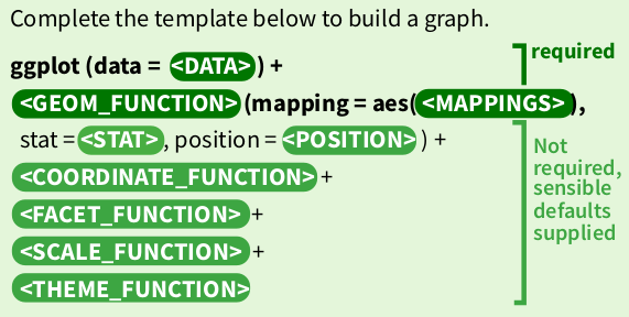
ggplot2 states that graphs are built from 3 components:
- a data set
- a coordinate system
- geoms (specifications of aesthetic elements e.g. x and y locations, shape, size, and colour of data points)
Where a sensible default coordinate system is useful for most graphs, the <data> and <geoms> components need to be provided by the user.
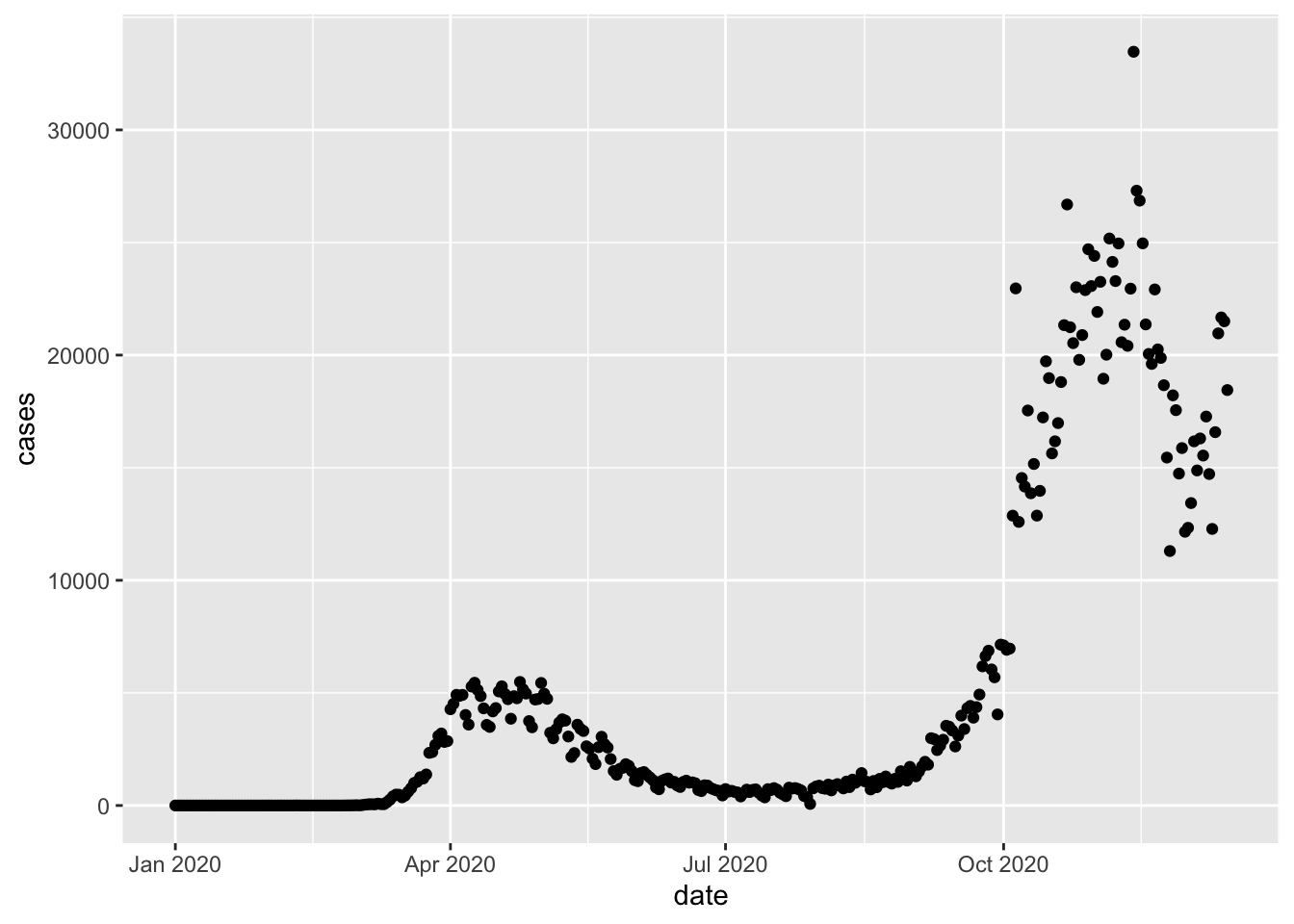
Here we tell ggplot that we want to draw a plot based on a data frame named uk_cases, and we pick the geom_point function to draw the data as points on the graph. We want to map the date column to the x axis, and the cases column to the y axis.
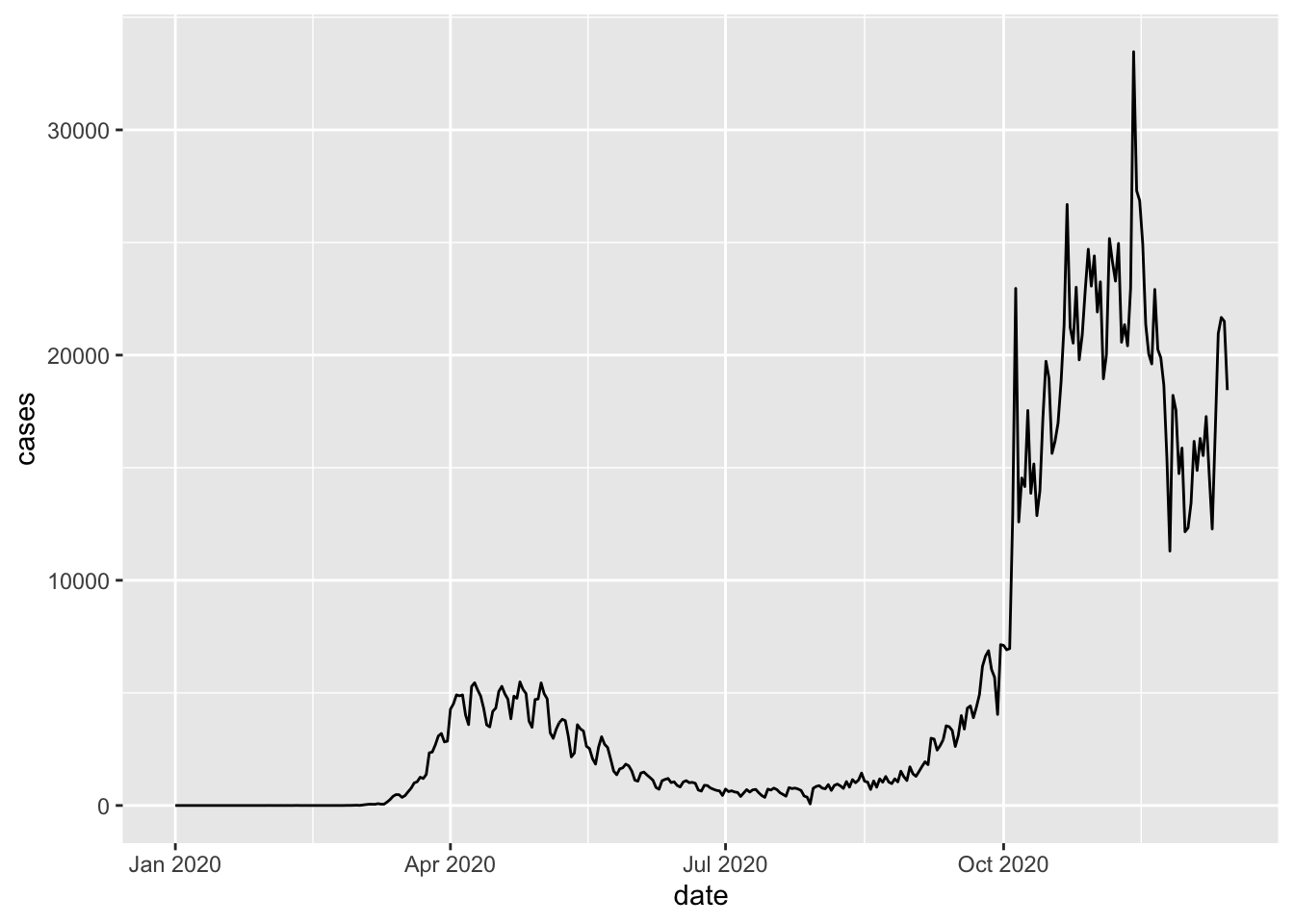
This is good, but often time series are drawn as lines. So let’s replace geom_point with geom_line
This looks better already. But what if I want both points and lines?
- Let’s stack the two layers together.
- We also add an additional
geom_smoothlayer to give us some visual on the overall trend.
`geom_smooth()` using formula = 'y ~ x'
The graph is overly busy for no good reason now, but we demonstrated how different layers can be created by different geom functions and stacked together.
- More on
geom_smooth: https://ggplot2.tidyverse.org/reference/geom_smooth.html - On
loess: https://en.wikipedia.org/wiki/Local_regression
13.2.2.3 Inheritance
So far the data + geom_func(aes) grammar is readable from the code, but we also see some repetition of the code segment mapping = aes(x = date, y = cases) appearing 3 times in our code. To simplify our code, a mechanism called inheritance can be utilised.
?geom_point and ?geom_line both show that a parameter inherit.aes is TRUE by default, which allows both geom functions to inherit the aesthetics mapping from the base layer defined by ggplot
`geom_smooth()` using method = 'loess' and formula = 'y ~ x'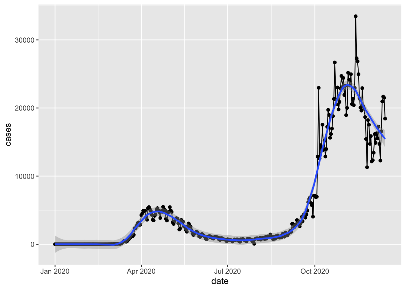
We can see that using inheritance, we produced exactly the same plot without repeating ourselves. (Don’t repeat yourself is a principle applied in good software practices).
Note that we lost the data and mapping keywords too, and the aes definition only appear once in the code. We now have shorter and easier code to maintain, but the grammar in grammar of graphics has become less obvious. This is also why every online tutorial is slightly different to each other despite performing the same actions. Reading others’ codes is a very useful way to improve your own coding skill.
13.2.2.4 Overwrite
Get data for United States in us_cases.
We reset the UK time series to just one plot using the points and add the US time series as a line. The UK case numbers look a lot less scary now.
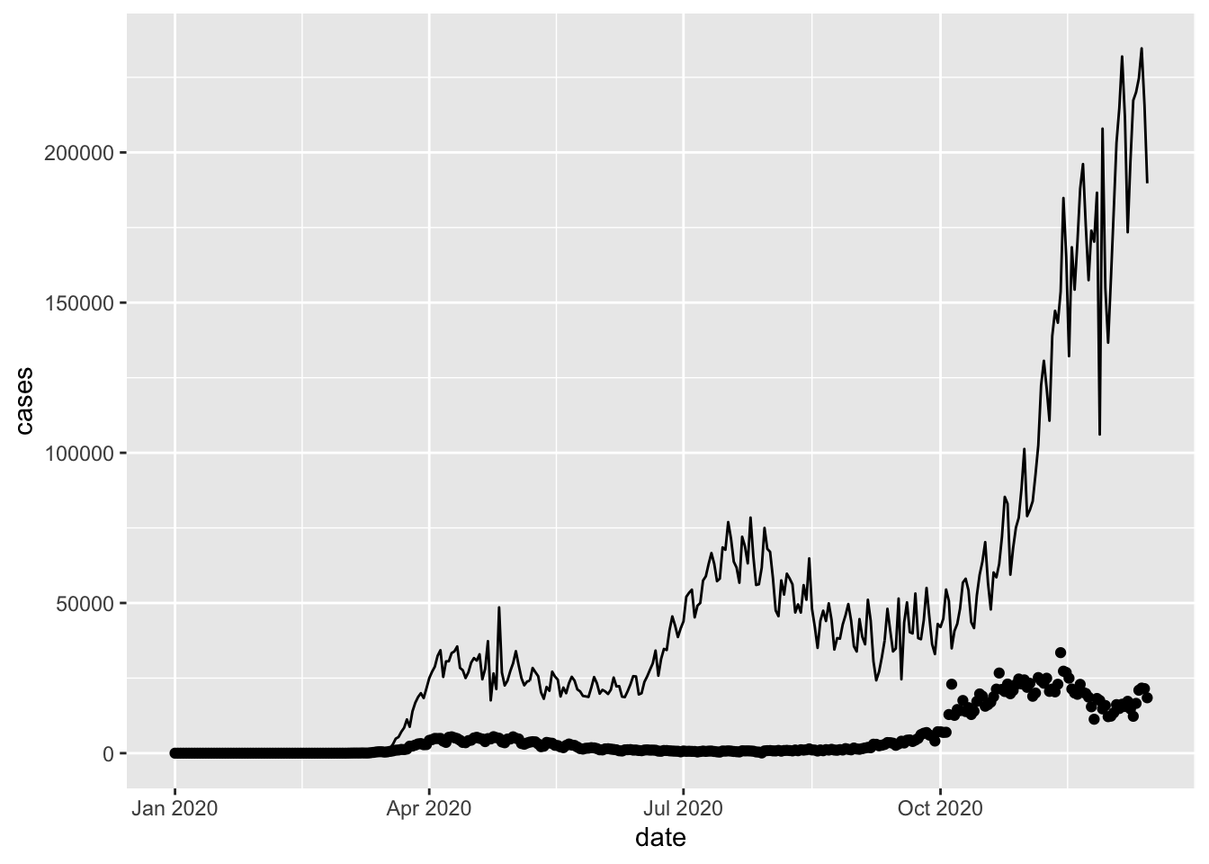
The data = us_cases statement in geom_line() now overwrites the data = uk_cases statement inherited from the base layer constructed by the ggplot function.
Question: Here, the
aesdid not need to be re-stated ingeom_linedespite having a differentdatato plot. Why?
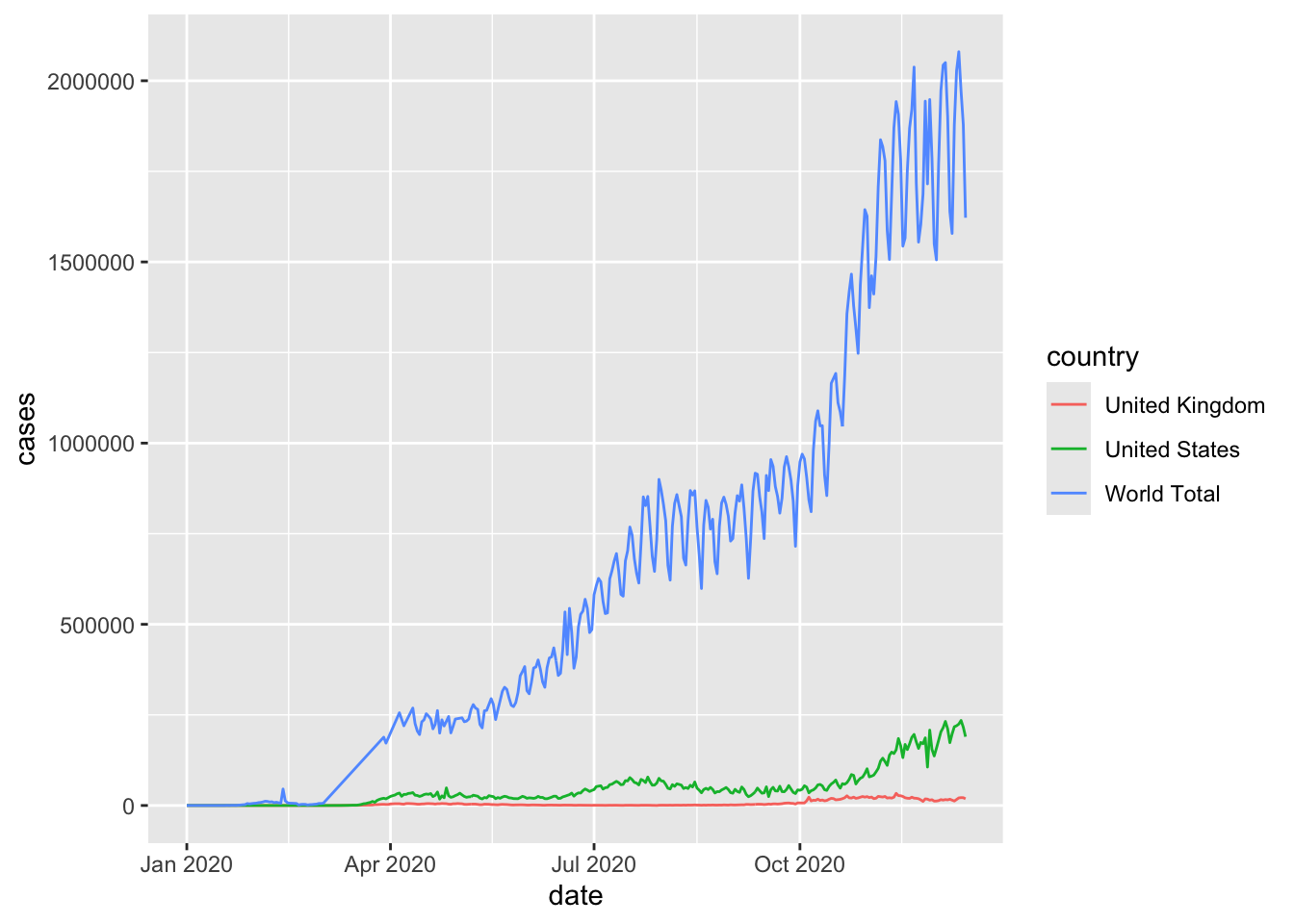
Let’s add the world total number of daily cases to our graph too. We draw all three time series with lines.
world_sum <- aggregate(cases[, "cases"], list(date = cases[["date"]]), sum) # Forgot to filter the rows for the continents here
#unique(cases[["country"]])
world_sum <- world_sum[rowSums(is.na(world_sum)) == 0, ]

ggplot(mapping = aes(x = date, y = cases)) +
  geom_line(data = world_sum) +
  geom_line(data = uk_cases) +
  geom_line(data = us_cases)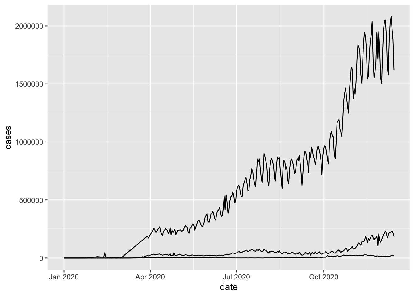
Note that each of the three lines are from a different data frame.
Question: If we remove
mapping =fromggplotso that it is written likeggplot(aes(x = date, y = cases)) + ....would it still work?
13.2.2.5 Colours, labels, scales, and coordinates
Now let’s better the graph so that
- The three time series are distinguishable
- Both axes are labeled clearly
- Ticks on the axes are more informative
- Y is in log-scale
- Remove the grey background
- Truncate the lines so that the plot covers exactly one year in time
options(scipen = 999)  # turn off scientific notation like 1e+06

g <- ggplot(mapping = aes(x = date, y = cases)) +
  geom_line(data = world_sum, aes(color = "World")) +
  geom_line(data = uk_cases,  aes(color = "UK")) +
  geom_line(data = us_cases,  aes(color = "US")) +
  labs(
    x = "Dates",
    y = "Daily Cases",
    title = "Covid-19 daily cases comparison",
    subtitle = "1 year tracker",
    caption = "source: CoMo"
  ) +
  scale_y_log10(
    breaks = scales::trans_breaks("log10", function(x) 10^x),
    labels = scales::trans_format("log10", scales::math_format(10^.x))
  ) +
  # scale_y_continuous(
  #   trans = "log10",
  #   breaks = scales::trans_breaks("log10", function(x) 10^x),
  #   labels = scales::trans_format("log10", scales::math_format(10^.x))
  # ) +
  annotation_logticks() +
  theme_bw() +
  scale_color_manual(
    # name="",
    values = c("World" = "black", "US" = "#50e2c1", "UK" = "#faaf3f")
  )

g1 <- g +
  scale_x_date(
    date_labels = "%b",
    date_breaks = "1 month",
    limits = as.Date(c("2020-03-01", "2021-03-01"))
  )
plot(g1)
Warning in scale_y_log10(breaks = scales::trans_breaks("log10", function(x) 10^x), : log-10 transformation introduced infinite values.
log-10 transformation introduced infinite values.
log-10 transformation introduced infinite values.Warning: Removed 60 rows containing missing values or values outside the scale range
(`geom_line()`).
Removed 60 rows containing missing values or values outside the scale range
(`geom_line()`).
Removed 60 rows containing missing values or values outside the scale range
(`geom_line()`).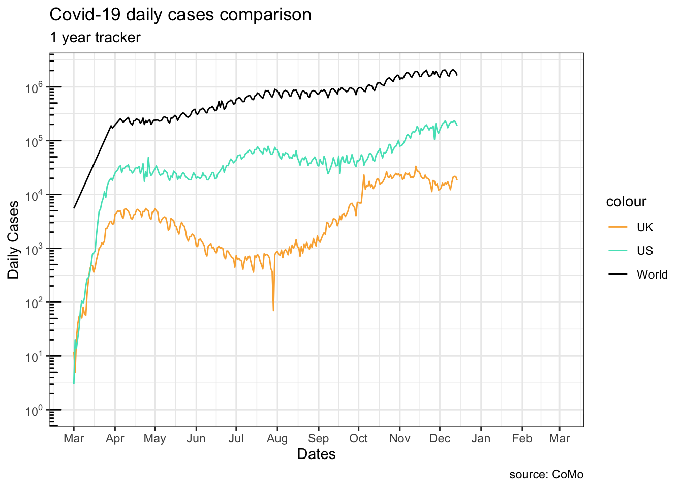
?ggplot2::labs?ggplot2::scale_y_continuous?ggplot2::annotation_logticks
13.2.2.6 Coordinate system
We can set x range by adjusting the <coordinate system> (last element of the grammar) instead.
Warning in scale_y_log10(breaks = scales::trans_breaks("log10", function(x) 10^x), : log-10 transformation introduced infinite values.
log-10 transformation introduced infinite values.
log-10 transformation introduced infinite values.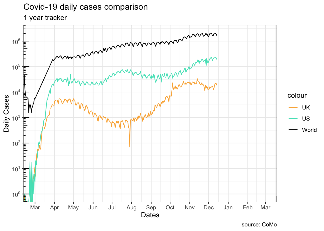
Note how g1 and g2 differ at truncating the lines at the beginning:
g1, settinglimitsin thescalefunction truncates the data before they are plottedg2, changing the coordinate system only modifies the viewing-window of the graph
This is mostly useful when you want to zoom in to an area of the plot.
Warning in scale_y_log10(breaks = scales::trans_breaks("log10", function(x) 10^x), : log-10 transformation introduced infinite values.
log-10 transformation introduced infinite values.
log-10 transformation introduced infinite values.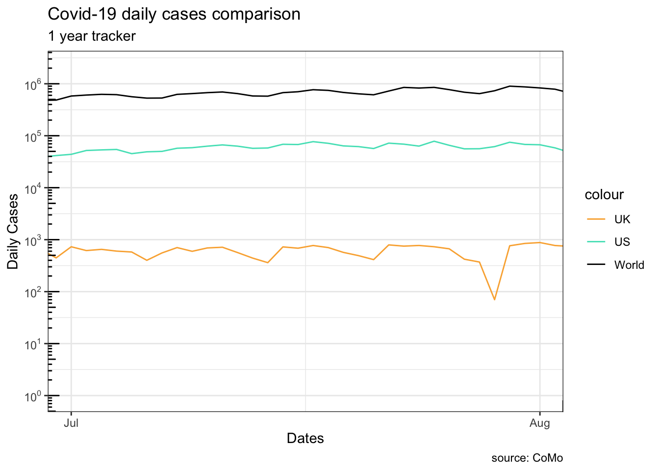
13.2.2.7 Annotations
uk_peak <- uk_cases[which.max(uk_cases[["cases"]]),]
g11 <- g1 +
  geom_curve(aes(
      xend = uk_peak[["date"]],
      yend = uk_peak[["cases"]],
      x = uk_peak[["date"]]+60,
      y = uk_peak[["cases"]]*1.5
    ),
    curvature = 0.2,
    arrow = arrow(length = unit(10, "points"))
  ) +
  geom_point(data = uk_peak, color = "#ffaf3f") +
  annotate(
    geom = "text",
    label = "UK max",
    x = uk_peak[["date"]]+80,
    y = uk_peak[["cases"]]*1.5
  )
plot(g11)
Warning in scale_y_log10(breaks = scales::trans_breaks("log10", function(x) 10^x), : log-10 transformation introduced infinite values.
log-10 transformation introduced infinite values.
log-10 transformation introduced infinite values.Warning: Removed 60 rows containing missing values or values outside the scale range
(`geom_line()`).
Removed 60 rows containing missing values or values outside the scale range
(`geom_line()`).
Removed 60 rows containing missing values or values outside the scale range
(`geom_line()`).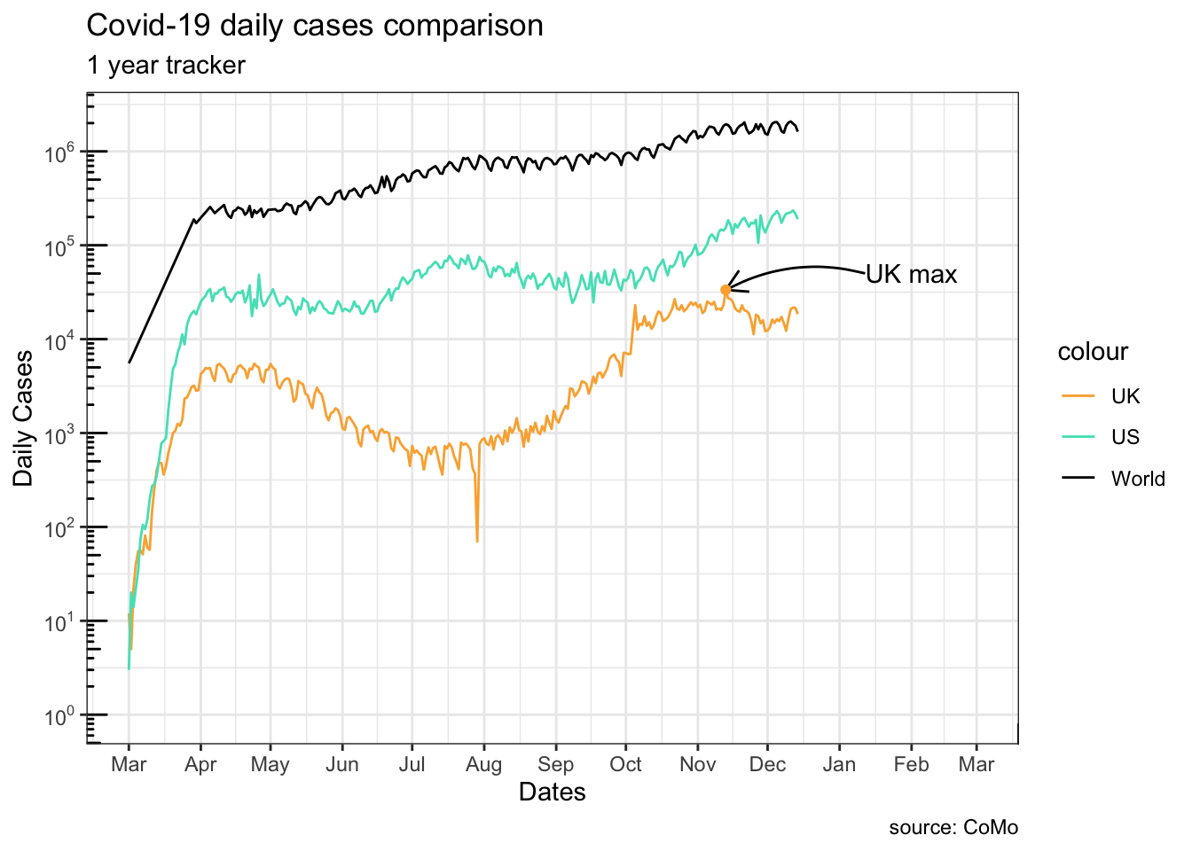
?ggplot2::annotation_logticks
13.3 Long and wide data format
In the previous section, we used three separate data frames side by side which resembles a Wide data format. For data in this format, each series is stored in its own column. No filtering is needed once the column has been specified. The <data> component needs redefinition in each <geom> layer because a different column is used.
The same set of data can be rearranged in a Long format. In such format, all series keep their data in the same column. To distinguish ownership of each row’s data, an extra column is created.
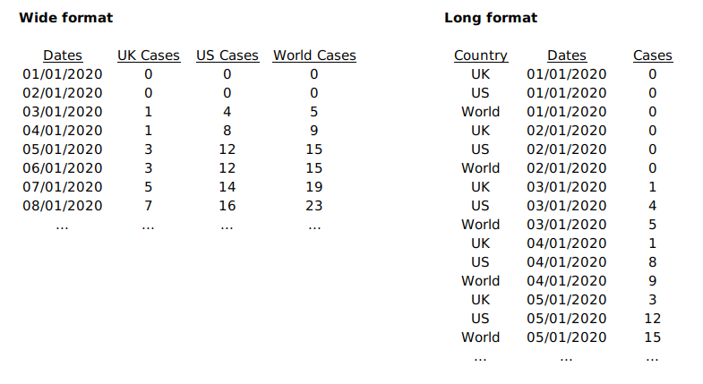
Note how R automatically added a legend to the plot. This comes when an aesthetic setting is dependent on a column,colour = country in this case.
13.4 More plot types
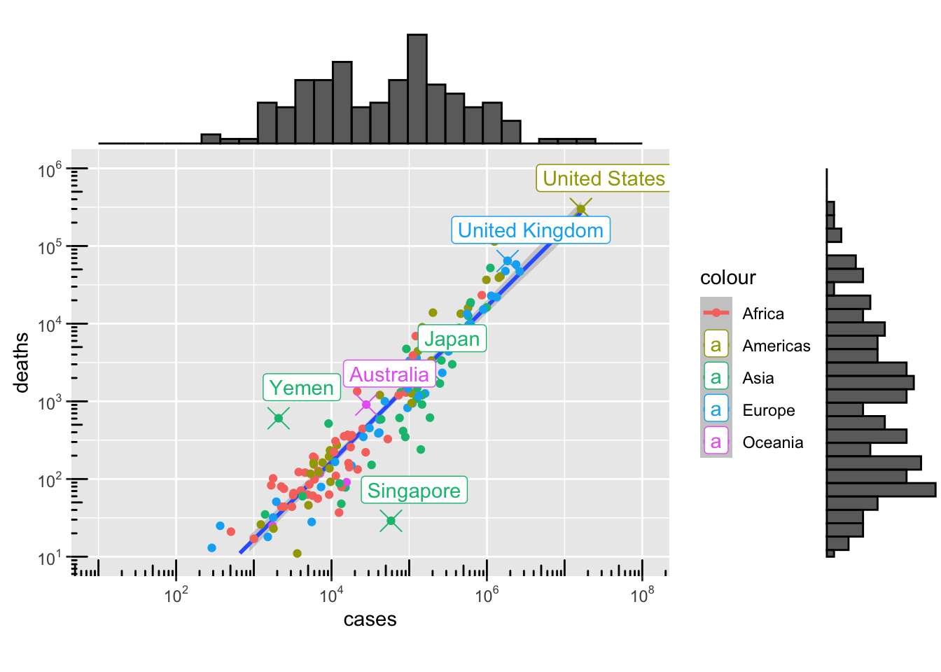
13.4.1 Scatter
per_country_sum <- aggregate(
  x = list(cases[, "cases"], cases[,"deaths"]),
  by = list(country = cases[["country"]]),
  FUN = sum,
  na.rm = TRUE
)

library("countrycode")
per_country_sum[["continent"]] <- countrycode(
                                      sourcevar = per_country_sum[,"country"],
                                      origin = "country.name",
                                      destination = "continent"
                                    )
Warning: Some values were not matched unambiguously: Africa, America, Asia, Europe, Kosovo, Oceania, Other continent, Worldper_country_sum <- per_country_sum[rowSums(is.na(per_country_sum)) == 0,]
per_country_sum <- per_country_sum[per_country_sum["deaths"] > 10,]
#paged_table(per_country_sum)
g4 <- ggplot(data = per_country_sum, aes(x = cases, y = deaths, colour = continent)) +
geom_smooth(data = per_country_sum, mapping = aes(colour = NULL), method = "lm", span = .2) +
geom_point() +
scale_y_log10(
breaks = scales::trans_breaks("log10", function(x) 10^x),
labels = scales::trans_format("log10", scales::math_format(10^.x)),
limits = c(10,10^6)
) +
scale_x_log10(
breaks = scales::trans_breaks("log10", function(x) 10^x),
labels = scales::trans_format("log10", scales::math_format(10^.x)),
limits = c(10,10^8)
) +
annotation_logticks() +
coord_fixed()
plot(g4)`geom_smooth()` using formula = 'y ~ x'Warning: Removed 6 rows containing missing values or values outside the scale range
(`geom_smooth()`).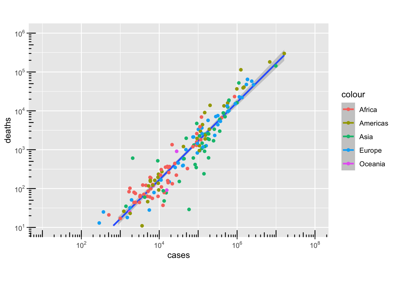
min_death_rate <- per_country_sum[
                    which.min(
                      per_country_sum[["deaths"]]/per_country_sum[["cases"]]
                    ),
                  ]
max_death_rate <- per_country_sum[
                    which.max(
                      per_country_sum[["deaths"]]/per_country_sum[["cases"]]
                    ),
                  ]
max_death_count <- per_country_sum[
                    which.max(
                      per_country_sum[["deaths"]]
                    ),
                  ]
max_cases_count <- per_country_sum[
                    which.max(
                      per_country_sum[["cases"]]
                    ),
                  ]

interested_countries <- per_country_sum[is.element(
                            per_country_sum[["country"]],
                            c("United Kingdom", "Australia", "Japan")
                        ),]

highlighted_rows <- rbind(
                      min_death_rate,
                      max_death_rate,
                      max_death_count,
                      max_cases_count,
                      interested_countries
                    )

g41 <- g4 +
  geom_point(
    data = highlighted_rows,
    shape = 4,
    size = 5
  ) +
  geom_label(
    data = highlighted_rows,
    mapping = aes(label = country),
    nudge_x = 0.3,
    nudge_y = 0.4
  )

plot(g41)
`geom_smooth()` using formula = 'y ~ x'Warning: Removed 6 rows containing missing values or values outside the scale range
(`geom_smooth()`).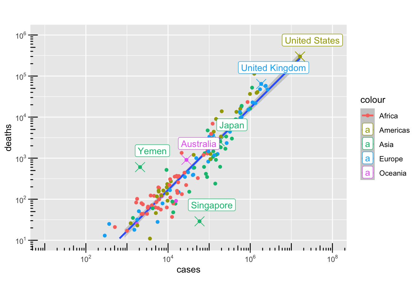
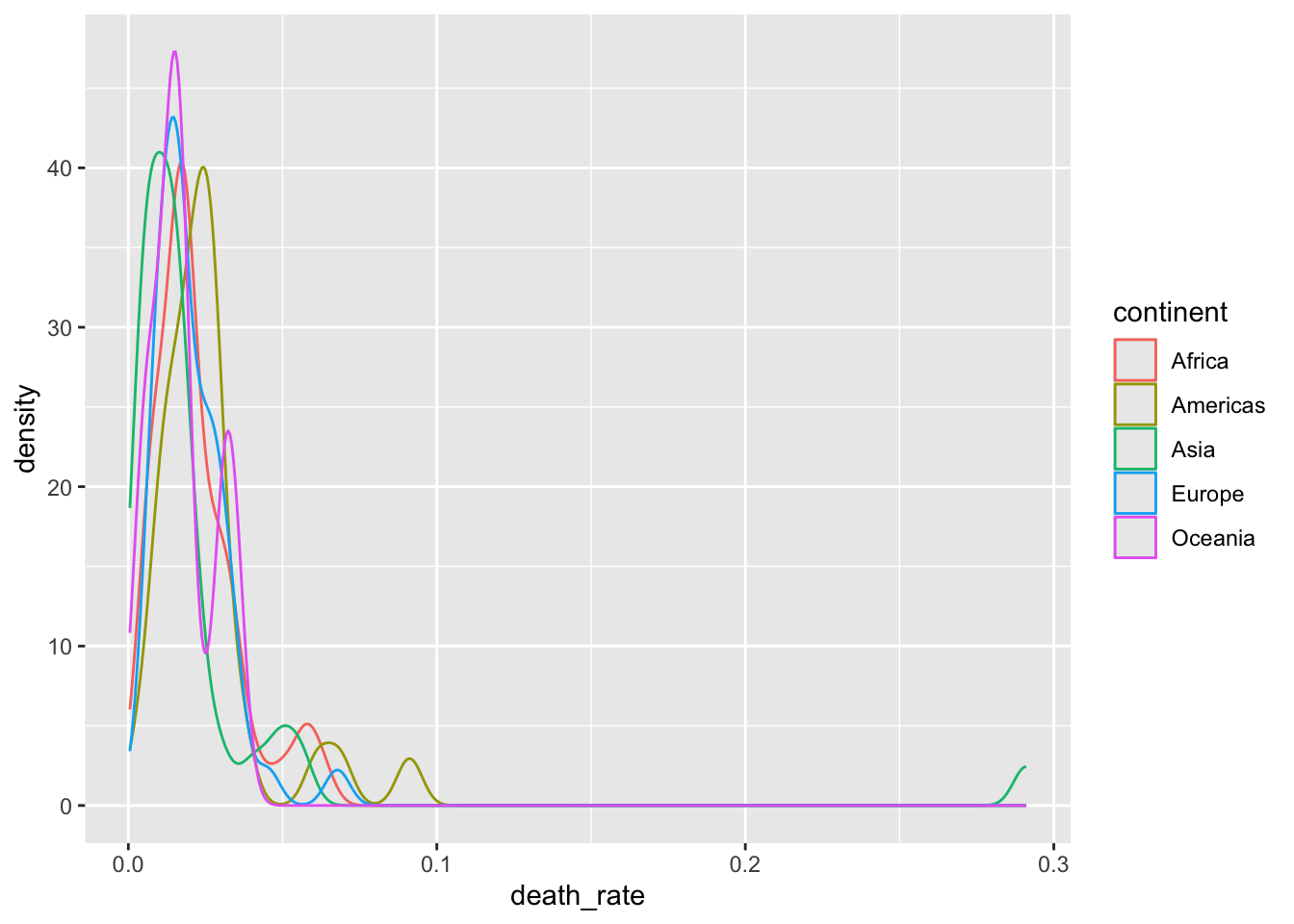
13.4.2 Density
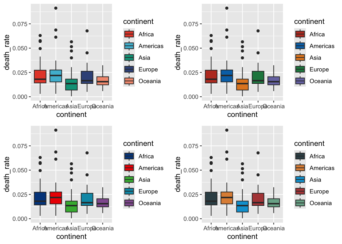
13.4.3 Boxplot
Warning in fortify(data, ...): Arguments in `...` must be used.
✖ Problematic argument:
• alpha = 0.5
ℹ Did you misspell an argument name?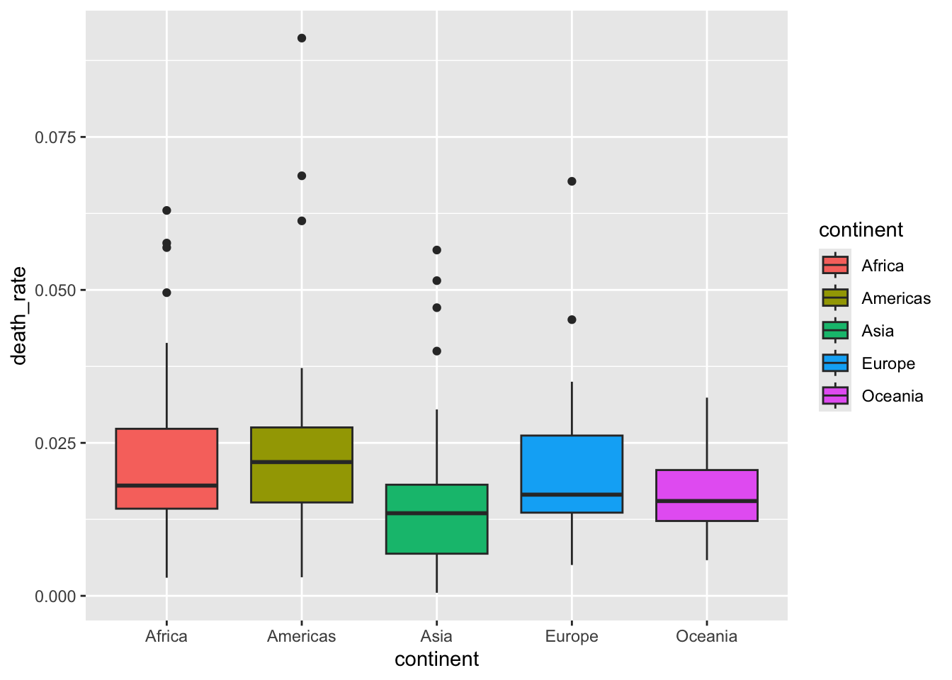
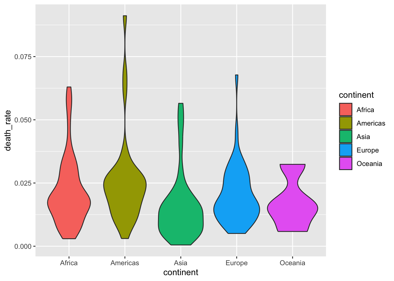
13.5 Other related packages
ggsci, Scientific Journal and Sci-Fi Themed Color Palettes for ggplot2gridExtra, Miscellaneous Functions for “Grid” Graphics
ggExtra, Marginal Histograms and Boxplots
13.6 Read more about ggplot2
- 50 Examples http://r-statistics.co/Top50-Ggplot2-Visualizations-MasterList-R-Code.html
- ggplot2: Elegant Graphics for Data Analysis https://ggplot2-book.org/introduction.html
- grid.arrange https://cran.r-project.org/web/packages/egg/vignettes/Ecosystem.html
13.7 Challenge
Find an open access article from Nature Communications and reproduce a plot from the article.
- Articles are listed on https://www.nature.com/ncomms/articles?type=article
- Use the search box on the top right of the page to find articles of your interest (e.g. “covid-19”, “malaria”, “epidemiology”, “modelling etc. ).
- Most articles include the data they use for their figures in the “Source Data” section.
- Use the source data
- e.g. https://www.nature.com/articles/s41467-021-24997-7#Sec41
Your version of the plot can be a exact replica of the author’s plot if you think it is of good quality, you can also make an improved version of the original plot if you see fit.
Further Topics
Publication-quality figures
Nicolas P. Rougier, Michael Droettboom, Philip E. Bourne, Ten Simple Rules for Better Figures, PLOS Computational Biology, code
Daniel Evanko, Data Visualization: A view of every Points of View column, Nature Methods, methagora
Tamara Munzner, Talk on d3.unconf(2015), Video: Visualization Analysis & Design
Tamara Munzner, Talk, Visualisation Analysis & Design
Tamara Munzner, Video: Map Color and Other Channels. Visualization Analysis & Design Tutorial, Video 6
Colours in R
The + operator
Each layer on the ggplot graph stack is defined by a function, and these functions are all concatenated with the + operator. We know how + is defined for literals, such as in 1 + 2 or "abc" + "def". But what does it do in between ggplot functions?
Whereas commonly used math functions such as max, abs, and sqrt return the user with a numerical value, these functions such as the geom functions perform a set of procedures that either produce or modify a plot or several plots in the graph stack. The + operator here not only sticks these plots and performs the procedures one by one to produce the final graph. Because these functions are of different nature, the + operator in this context also acts as a dispatcher. For those interested in knowing more about this subject and what’s going on behind the scenes:
ref: https://stackoverflow.com/questions/40450904/how-is-ggplot2-plus-operator-defined