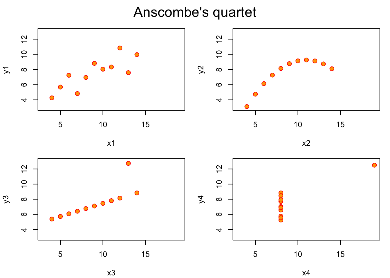
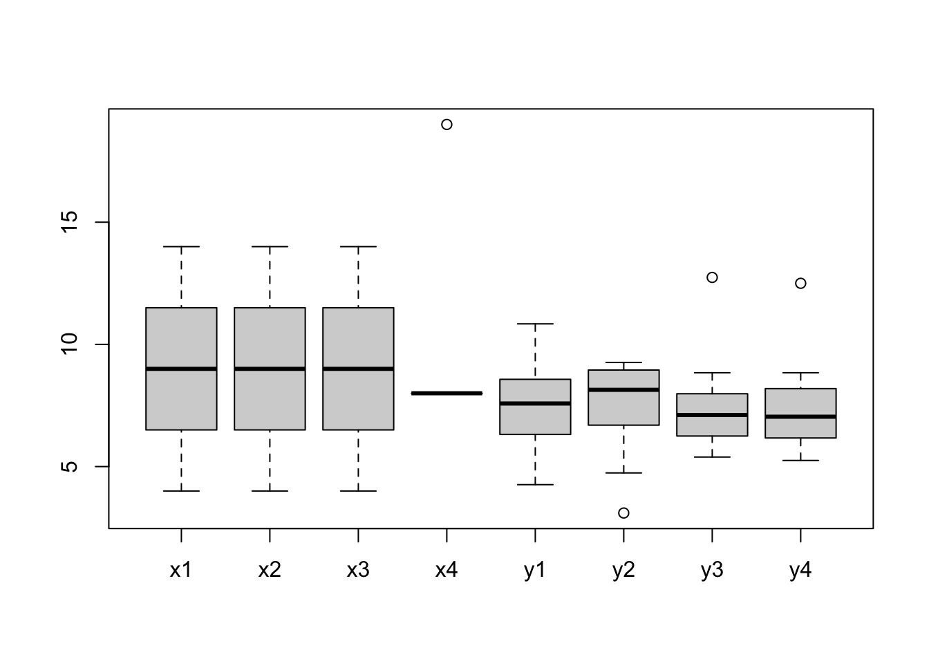
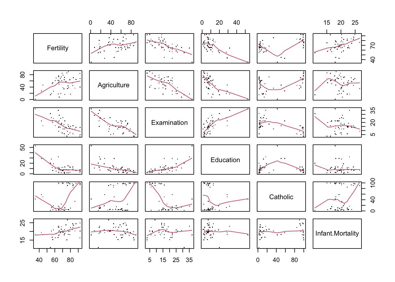
Among the many datasets included in R, there is one named anscombe. This dataset comes from the journal article authored by the F. J. Anscombe published on The American Statistician journal in 1973, titled Graphs in Statistical Analysis.
There are eight columns in anscombe giving four pairs of x and y values:
(x1, y1)
(x2, y2)
(x3, y3)
(x4, y4)
Let’s take a look at some of the descriptive statistics of the dataset:
The four sets of x-y pairs don’t seem to be different according to the statistical values. So we should expect to see four very similar shapes once they are plotted:
#?anscombe# PAR_DEFAULTS <- par(no.readonly = TRUE)ff <- y ~ xpar(mfrow =c(2, 2), mar =0.1+c(4, 4, 1, 1), oma =c(0, 0, 2, 0))for(i in1:4) { ff[2:3] <-lapply(paste0(c("y", "x"), i), as.name)plot(ff, data = anscombe, col ="red", pch =21, bg ="orange", cex =1.2,xlim =c(3, 19), ylim =c(3, 13))}mtext("Anscombe's quartet", outer =TRUE, cex =1.5)
# par(PAR_DEFAULTS)
This dataset, published in 1973, demonstrates the importance of data visualisation. Graphics is not only useful for presenting results, but also for data analysis and discovery.
Datasaurus is a modern iteration of Anscombe’s quartet.
12.2 Formulae, y ~ x
?formula - An expression of the form y ~ model is interpreted as a specification that the response y is modelled by a linear predictor specified symbolically by model.
Familiarity with statistical concepts and terms is needed to understand formulae definition in R. We will talk about statistical models in the following sessions, but more details will be given in the Statistics module later in the term. We give brief introduction in this session, which is sufficient for the purpose of this module.
Suppose x1 and x2 are independent variables, y is the response / dependent variable, a formula fm may be defined as follows:
fm <- y ~ x1 + x2 # y is a function of x1 and x2terms(fm)typeof(fm)class(fm)attributes(fm)str(fm)length(fm)fm[[1]]fm[[2]]fm[[3]]#fm <- ~ x1 + x2 # one-sided formula
Formula expresses a relationship between variables
~, tilde is used to separate the left- and right-hand sides in a model formula
LHS of ~ are the dependent variable (a.k.a response, outcome, label)
RHS of ~ are the independent variables (a.k.a predictor, controlled variable, feature)
+, join variables
-, remove variable
*, crossing
%in%, nesting
^, to the specified degree
., all other variables that have not been included in the formula
poly(x, degree = d), the orthogonal polynomials of degree d over x
I(x), x is treated as is, i.e. poly(x, 2) is equivalent to 1 + x + I(x^2)
fm <-as.formula("y ~ x1 + x2") # string to formulatypeof(fm)terms(fm)all.vars(fm)fm <-update(fm, ~. + x3)fmfm <- y ~ x +I(x^2) # I(), as-is operatorfm
12.3 Base R graphics
Part of base R is the graphics package (?graphics) which contains functions for base graphics. The graphic functions are divided into three groups:
High-level commands - create a new plot
plot
barplot
hist
curve
coplot
…
Low-level commands - add information / graphics to existing plot
points
lines
text
abline
polygon
arrows
legend
title(main, sub)
axis
…
Interactive - reactive to mouse clicks on the graph
locator
identify
These commands are all well documented, e.g. ?curve. In this session, we give a few example of commonly used plotting commands.
To list the functions available in graphics package:
ls("package:graphics")
lsf.str("package:graphics")
12.3.1 High-level commands
12.3.1.1plot
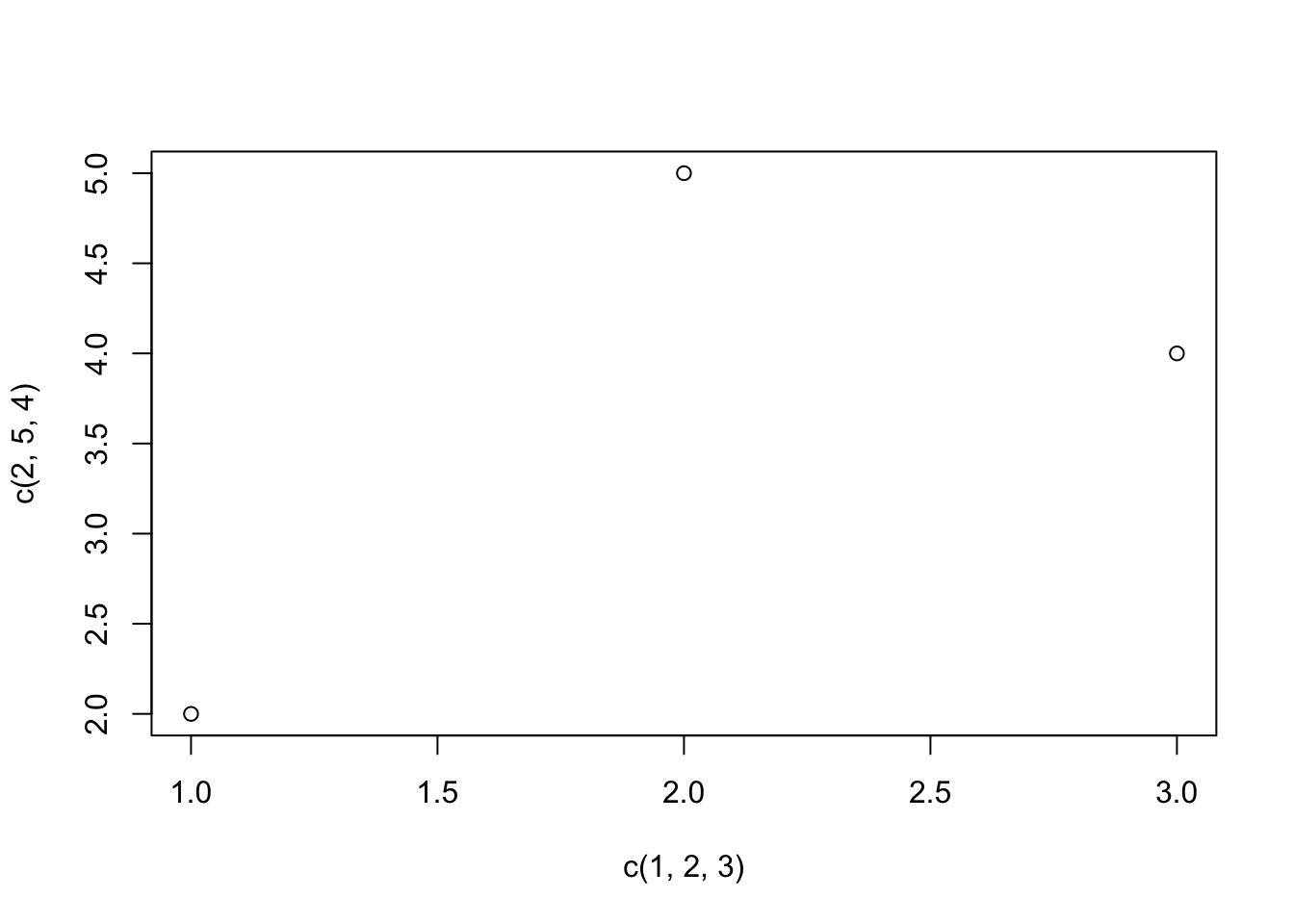
# Plot three data pointsplot(x =c(1, 2, 3), y =c(2, 5, 4))
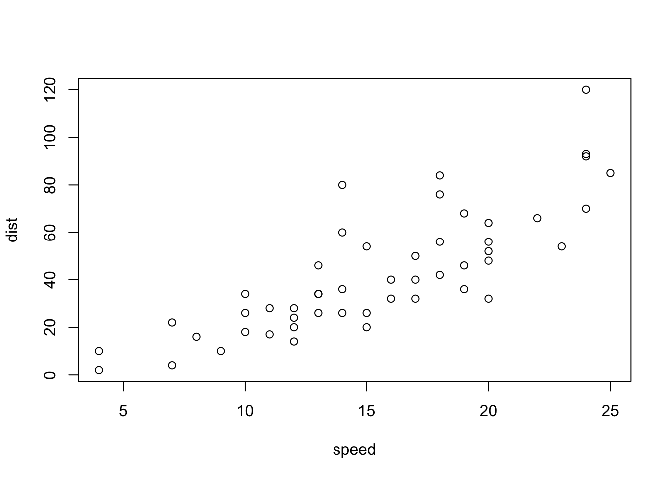
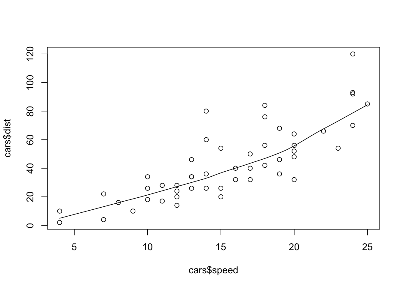
We use built-in dataset cars which contains data for two variables:
summary(cars)
     speed           dist
 Min.   : 4.0   Min.   :  2.00
 1st Qu.:12.0   1st Qu.: 26.00
 Median :15.0   Median : 36.00
 Mean   :15.4   Mean   : 42.98
 3rd Qu.:19.0   3rd Qu.: 56.00
 Max.   :25.0   Max.   :120.00
The simplest form:
plot(cars)
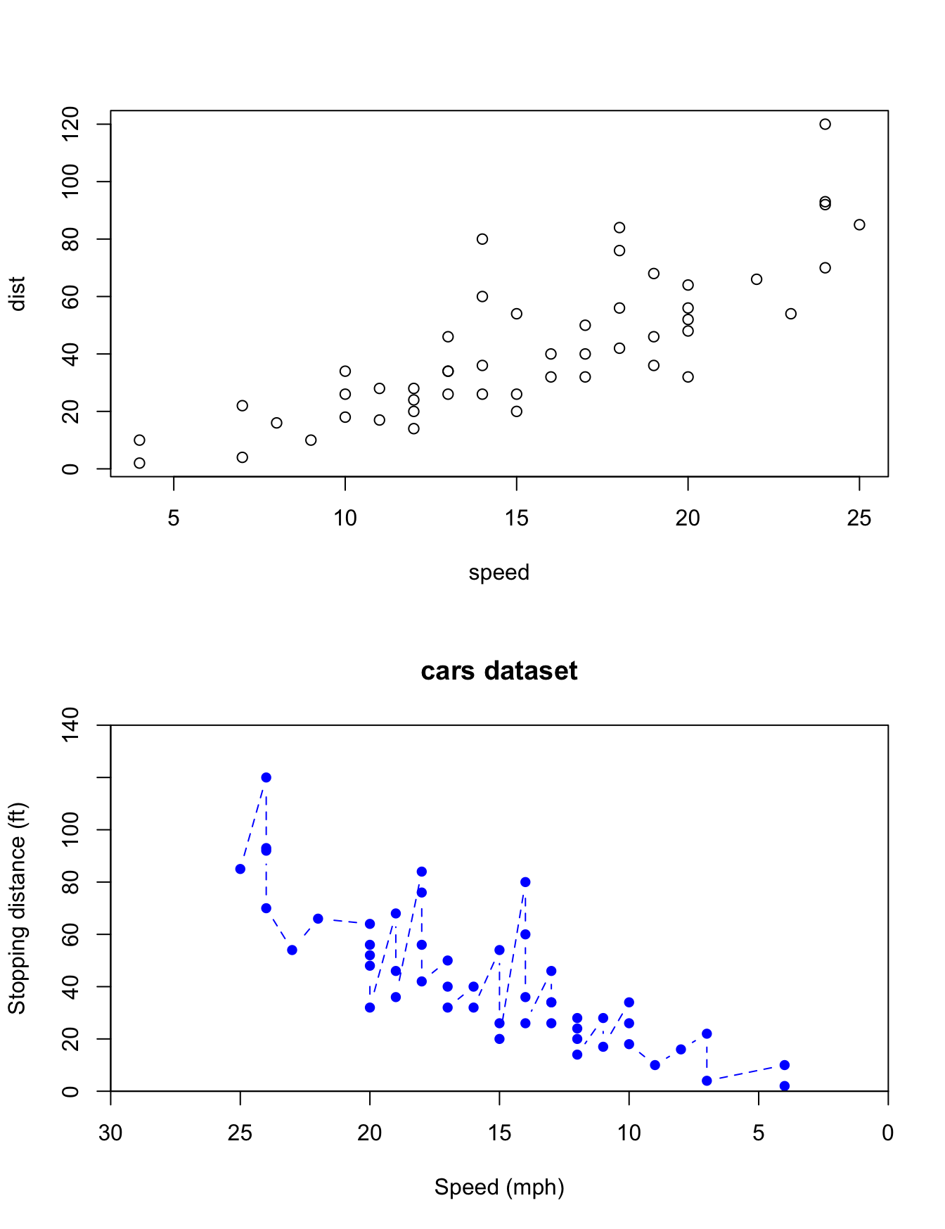
# as long as the data is in matrix formplot(as.matrix(cars)) # matrix works just fine# specify the columns in formula formplot(dist ~ speed, data = cars)# specify xy values by vectorplot(x = cars$dist, y = cars$speed)# - the axes are swapped# - axis labels
Plots can be added to the existing plot with the add option (only available in some high-level plotting commands. e.g. ?barplot, ?stripchart, ?curve)
Low-level commands can modify elements in the existing plot
12.3.2 Low-level commands
We’ve seen in the previous example how extra information can be added to plots created by high-level commands. We give another example:
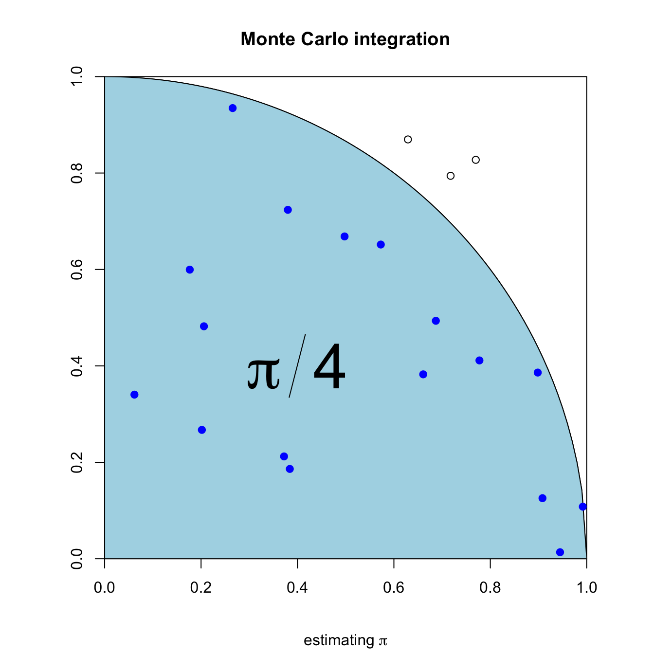
{xs <-seq(0, 1, by =0.01)ys <-sqrt(1- xs^2)set.seed(1)xp <-runif(n)yp <-runif(n)ic <- xp^2+ yp^2<1n <-1000par(pty="s")plot(0:1, 0:1, type ="n", asp =1, xaxs ="i", yaxs ="i",xlab ="", ylab ="")lines(x = xs, y = ys)# curve(sqrt(1 - x^2), 0, 1, add = TRUE)#curve(-sqrt(1 - x^2), -1, 1, add = TRUE)polygon(c(xs, 1, 0), c(ys, 0, 0), col ="lightblue")points(xp[ic], yp[ic], col ="blue", pch =19)points(xp[!ic], yp[!ic], col ="black", pch =1)text(0.4, 0.4, expression(pi/4), cex =4, bg ="red")title(main ="Monte Carlo integration", sub =expression(paste("estimating ", pi)))}
points, add scattered points
lines, add lines
text, annotate graph with text
abline, add straight line, shorthand for horizontal or vertical
polygon, add a shaded area
arrows, add arrow
legend, add legend
title(main =, sub =), add title to plot
axis, edit axis
12.4stats graphics
The commands we demonstrated so far are from the graphics package which is part of base R. Another key package in base R is the stats package, which also includes some plotting commands. Take a look at ls("package:stats") for more. We give a short example
scatter.smooth(x = cars$speed, y = cars$dist)
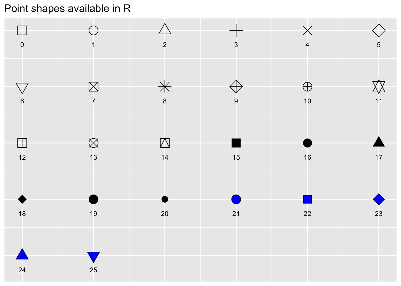
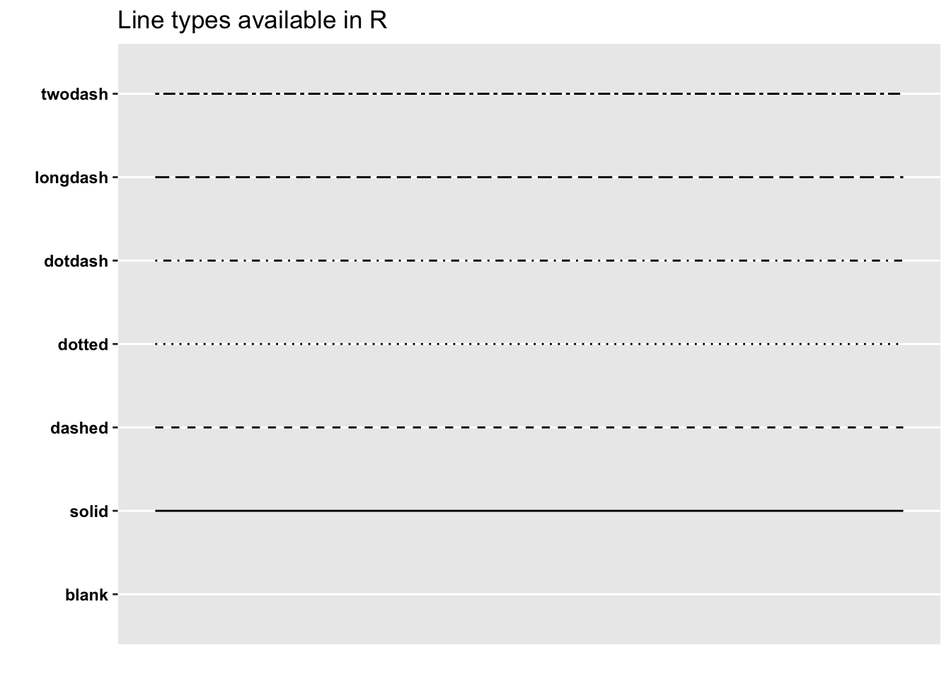
12.5 Graphical Parameters
Many of the graph settings are set via the par command. For a full list, refer to ?par. We give a lookup table for two most frequently used parameters.